Insurance Payments App
ROLE:
I consulted with a Fortune 500 insurance and investment firm on the development of design concepts for its very first mobile app.
Working in collaboration with an international multidisciplinary agile development team, I advocated for user-centered design practices, with sensitivity to branding, business needs, and iOS UI conventions.
I delivered high-fidelity visual mockups detailing navigation, informational views, and numerous prototypes related to the flows of making payments and editing account information in-app, and contributed elements to iterations of login, registration, and customer support flows, while leading twice-weekly stakeholder presentations of design work in progress.
At right: the home screen, a view called "Overview," showing the user's portfolio of products in a flippable view of index cards, each of which is tappable, to see that product's line items in detail.
Please note: A limited selection of assets are shown to protect client's identity. Those shown may be redacted and otherwise anonymized.

GOALS:
-
Deliver an experience familiar to website users, but improving upon that experience with streamlined, touchscreen-optimized interaction design whenever possible.
-
Make important informational values visible with the fewest taps.
-
Employ comparative industry research to learn and improve upon the experience of other financial competitors.
-
Take inspiration from Apple's Human Interface Guidelines to enable an app feel that "rhymes" with that of users' other apps.
-
Increase efficiency of data entry and navigation with error handling techniques and generous tappable areas that are empathetic to the likely age group of the app's users.
-
Use the limited palette of approved brand colors to encode information about the company's diverse lines of business.
(At right: login [redacted])

NAVIGATION AND CONTRACT DETAILS VIEW:
-
Skeuomorphic index card view evoking a file cabinet.
-
Less commonly-requested data points hidden behind a tap, improving app speed and performance by not calling for this data until requested by user.
-
Tapping a card initiates a brief flattening animation, ending with the reveal of the complete informational contract details view. The view is dismissed by swiping it downwards via the top affordance, back into the "cabinet.
-
Once inside the contract details view, vertical scroll and category headings allow perusal of multiple categories of information without additional taps, an improvement on the website experience.
-
Single-font typography and specific but limited color palette (with card borders and category headings in colors coded to the client's 4 lines of business provides an immersive branded experience. (shown: the blue designated for annuities).
(shown at right: transition animation, with long details view.)


PAYMENTS:
-
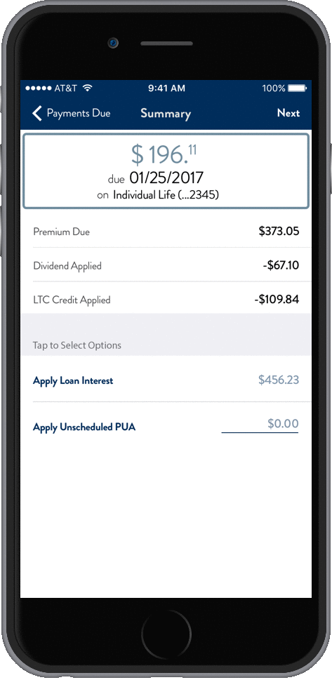
Flow begins with display (left) of all payment-eligible policies and contracts, ordered with priority given to those due soonest.
-
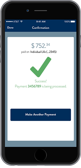
Tapping a policy initiates a three-screen flow (below) starting with a payment summary screen that when applicable allows conditional, optional add-ons to the payment, such as loan interest. This process is largely accomplished with one thumb, with arithmetic done dynamically in the top card according to user's choices.
-
Bank details screen provides inline validation of values before "Pay" button is enabled, reducing possibility of errors.
-
Confirmation screen allows a clean path to make the next payment, if applicable.


PROFILE EDITS
-
I delivered a scrolling view for editing account information (left), and mockups of flows related to seven major editing scenarios (representative screens below):
-
Addresses
-
E-mail address
-
Telephone number
-
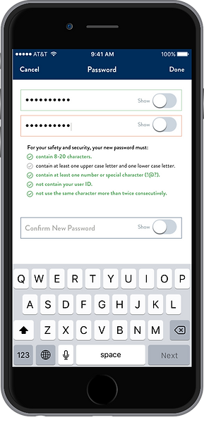
Password
-
Personal product nicknames
-
Security codes
-
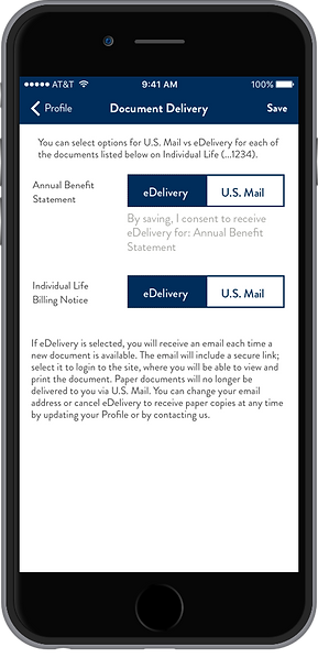
Document Delivery Preferences
-
-
Proactive inline error validation was employed extensively to reduce errors in data entry and the ensuing complications they cause.
-
Research determined that likely users tended to have multiple financial products on file and would benefit from streamlined systems for bulk editing addresses and security codes.
-
A uniform "Toast" message for each flow, emerging from above to cover the nav bar was devised to give positive feedback upon successful save of updated information.
Address (with toast)

Password

Product Nicknames


Telephone
Security Codes

Document Preferences